Page Contents
ToggleEveryone wants to be a pro in everything. But truth be told, there are things that we cannot all achieve. For instance, we are sure you sometimes wonder why some infographics are more convincing than others. Well, we are here for that.
Before we get deeper, understand that excellent data visualization is crucial to good communication, whether you are preparing a report for stakeholders, delivering critical concepts to paper writers with professional experience, or explaining complex data to the public. You must learn the basics and shun common mistakes to deliver more convincing data.
It is not an easy task, which is why not everyone can create impactful infographics. However, you can also learn by following a few hacks.
Hacks for Making Infographics Interesting and Informative
By comprehending these tips, you put yourself in the right place to meet your presentation needs. Read through it to gather much-needed insights.
#1 Comprehend Your Audience
You cannot serve your audience perfectly unless you know what they want. Those who master customer expectations know their needs. You must strive to achieve this. You will not struggle to deliver relevant, engaging, and informative data because you know what is required.
Determining the nature of your audience, their knowledge level, and the context in which they will apply the information is crucial to delivering impactful infographics.
Those who understand the subject will not mind if you use technical terms. They can follow your presentations without any stress. However, assume you are presenting the results of your data analytics to the general public.
You must make it appealing to even novices who wish to learn more. Knowing your audience is, therefore, a game change in data presentation.
#2 Choose the Right Chart Type
Like working on anything, using the right tool is handy and effective. Thus, making the right choice when deciding what kind of chart to use in infographics is essential.
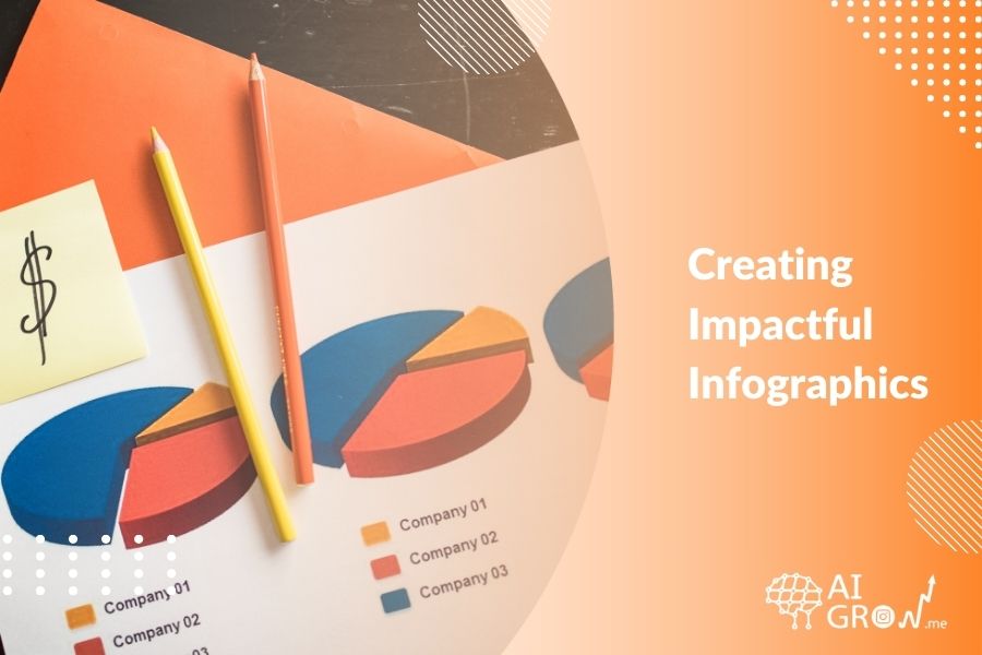
They all have advantages and disadvantages and are useful for certain data types. For example, line graphs effectively show changes over time, bar graphs are useful in comparing one group to others, and pie charts are great for presenting percentages.
Misunderstanding and ambiguity can easily creep in when you use the wrong chart type. Therefore, take note of the chart to present your data and message effectively.
#3 Use Color Strategically
The purpose of the colors you usein infographics is to help the reader understand better. So, they must not be distracting. Employ different background colors to show variances and to emphasize important information.
Specific color palettes assist in the creation of coherency in your visualizations. Color blindness is key here; therefore, choose color-blind safe palettes for your visuals. It is possible to select accessible and effective colors using different tools and guidelines.
The strategic choice of color can enable the viewer to notice vital information and familiarize themselves with the infographic.
#4 Simplify and Focus
The key to successful infographics is conciseness. Focus on the message you want to convey. Avoid data that can distract viewers from the original message. This includes any elements that do not contribute to the message that you are presenting to an audience.
Pay attention to the spacing between different blocks and try to make the text as easy as possible to read. Reduce the number of colors and fonts used to achieve consistency and professionalism.
Do not be overly complex. Take time and see what professionals online do. Masterpapers review can provide insights on achieving professionalism and conciseness. Note that a clean and simple design makes the information easy to read and emphasizes the most important information.
#5 Provide Context and Annotations
Annotations and text descriptions let viewers know the value of the number they see. Captions provide key information about the plot and possible challenges. Annotations also highlight the major aspects and trends in the data.
For example, a footnote may explain an outlier or validate a significant trend in the data. This is true, for it gives the background gen and tells the audience of an infographic what they are seeing and why it is relevant.
Common Errors in Creating Infographics
While delivering an excellent visual presentation is necessary, there are multiple mistakes you must avoid. Sometimes, they seem fit but, in the end, distort your message. Here are a few aspects to shun from.
#1 Information Overload
Do not be too detailed. This is because the audience will need help to get the key information they require. Information overload occurs when you deliberately use too much information that does not pertain directly to your story.
#2 Misleading Visuals
Truncated axes that focus on trends or disproportionate scales that overemphasize the quantitative aspect of certain points of data. Avoid it as much as possible.
Comparative graphics should be at the same scales and should not be presented in a way that is biased according to what is presented. Keep on monitoring your visuals.
#3 Inappropriate Labeling
It is easy to make even appealing infographics or data illegible because of inappropriate labeling. Focus on clarity and completeness while labeling because they are vital in effective data visualization.
Give descriptive headings and legends to each axis, variable, and section. Do not forget to include units of measurement when required. Annotations can emphasize particular information or trends, helping the viewer navigate the information.
#4 Data Reliability Ignorance
Do not do anything without verifying your data. It may not be important at that time but is crucial in ensuring credibility. No one wants to read your piece only to find flaws with data. So, take time and ensure anything you present is credible.
FAQs
Q1. How Do I Choose the Right Chart Type for My Infographics?
Choosing the right chart type depends on the type of data you want to visualize. For instance, use line graphs for showing trends over time, bar graphs for comparisons, and pie charts for percentages. Consider what message you want to convey and how the data will be interpreted by your audience to select the most suitable chart type.
Q2. What Are Some Tips for Effectively Using Colors in Infographics?
Colors should enhance readability and understanding. Use contrasting colors for clarity, avoid overly bright or distracting hues, and ensure your color choices are accessible to color-blind individuals. Tools like color-blind safe palettes can help in selecting appropriate colors that are both aesthetically pleasing and functional in conveying your message.
The Bottom Line
Some things are better to say than to do, and this is particularly the case when it comes to infographics. It is easy, but in the same sense, it is tricky; it is a mix of art and science because one has to consider the design principles and the audience’s needs.
You can easily translate complicated data into images if you know what to do and what not to do. With these in mind, you can make data understandable and memorable.